Applications
The main card displays the information of the deployed applications. To know more about the applications definition and structure, you can check Applications section.
Deployed app detail
- Deploying an application
- Deleting an application
- Inspecting the application
- Application info
- Application data refresh
Deploying an application
Our web interface is designed with versatility in mind, serving as a powerful tool to seamlessly deploy applications in various ways tailored to your needs. The deploy from catalog feature offers a wide range of pre-configured applications that you can deploy with just a few clicks, streamlining the process considerably. If you have custom code hosted on a git repository, our interface also enables you to directly deploy from there, providing integration with your development workflows, check the details here deploy from Git repository. Alternatively, you can opt to deploy an application using a YAML file, which allows for precision and control over your configurations, making it ideal for complex deployments. Dive into deploy applications from a set of YAML files. Whether you’re choosing deploying from the Catalog, using a git repository, or deploying a YAML file, our interface is equipped to accommodate your unique requirements and simplify your application deployment processes.
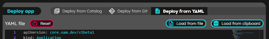
Deploy options
Deleting an application
When any app briefing card is clicked, the details are shown. On the top right corner of the app detail, it appears the  delete button that allows the user to delete the application from the environment.
Inspecting the application
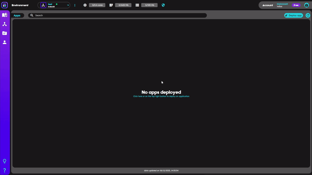
On the top of the apps card its shown, the search bar that allows to filter the apps displayed in the list, the refresh data button, and the deploy app button. The apps list displays up to four elements in a carrousel that is managed by two buttons (‘<’ and ‘>’) that enable to change the displayed elements between the list of available. Each app briefing card contains:
- the app name
- the app status (circle)
- an automatic generated visual id
- a list of the component statuses (squares)
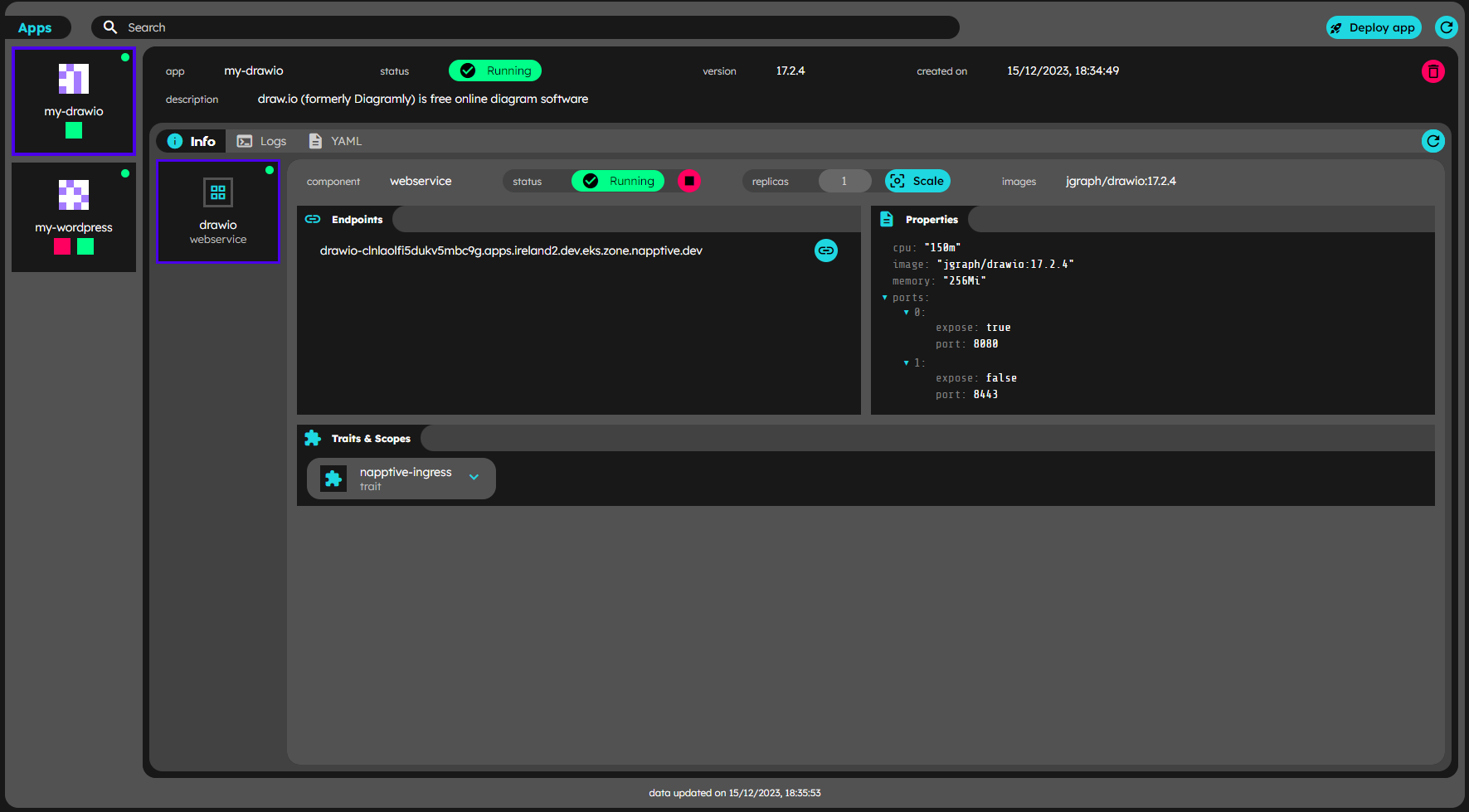
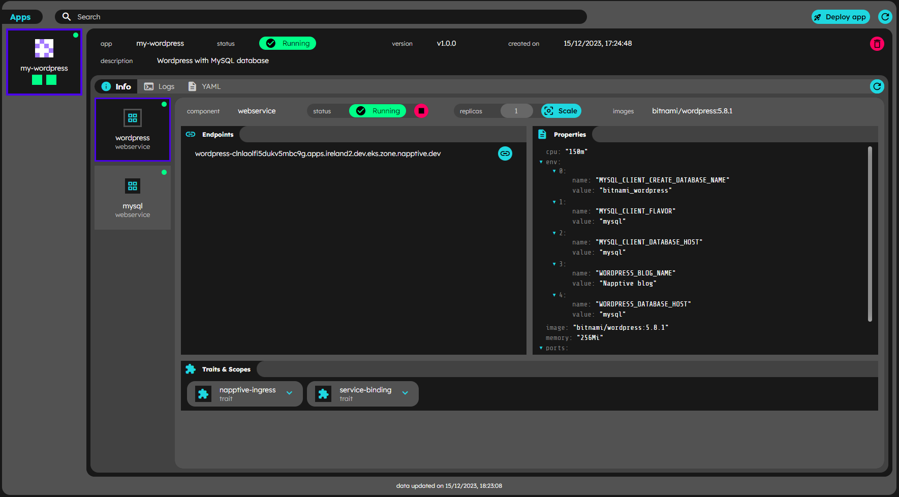
The user may access more detailed information clicking on any of the apps list items. The application detail card displays extended information related to it’s components and the related logs. The structure of the app detail info includes a header, that contains the name on the top, and a row with the visual id, status, version, created on, and description fields as well as a board containing the info (Application info) and logs (Application logs) tabs. For more information on the specific tab, check the corresponding section.
Application info
Deployed app detail
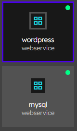
When the info tab is active in the application detail card, the board displays a list of items that includes workflow(if present), components and policies (if present). Each item in the list displays an indicator of the current status, the type of item in the list c for component, p for policy and w for workflow, the name of the item, and depending on the type it may display the image and the component/policy type on the top right corner. The specific information is accessible by selecting any item. The active element is marked with the top blue-to-purple gradient bar.
Items in the app detail list
Application endpoints
The user is enabled to navigate through the available information related to the active item. If the component has endpoints available, there will be a list of the available ones, with a button  to open it in a new tab.
Application data refresh
The deployed apps information is automatically refreshed as indicated in the data refresh section
Data refresh while deploying