Basic usage
Login
The first time that you join the web interface, you are required to log in with any of the available methods: GitHub account, Google account, or email and password. By clicking on any of the login buttons, you accept the terms and conditions of the service, and the web will be redirected to the main screen.
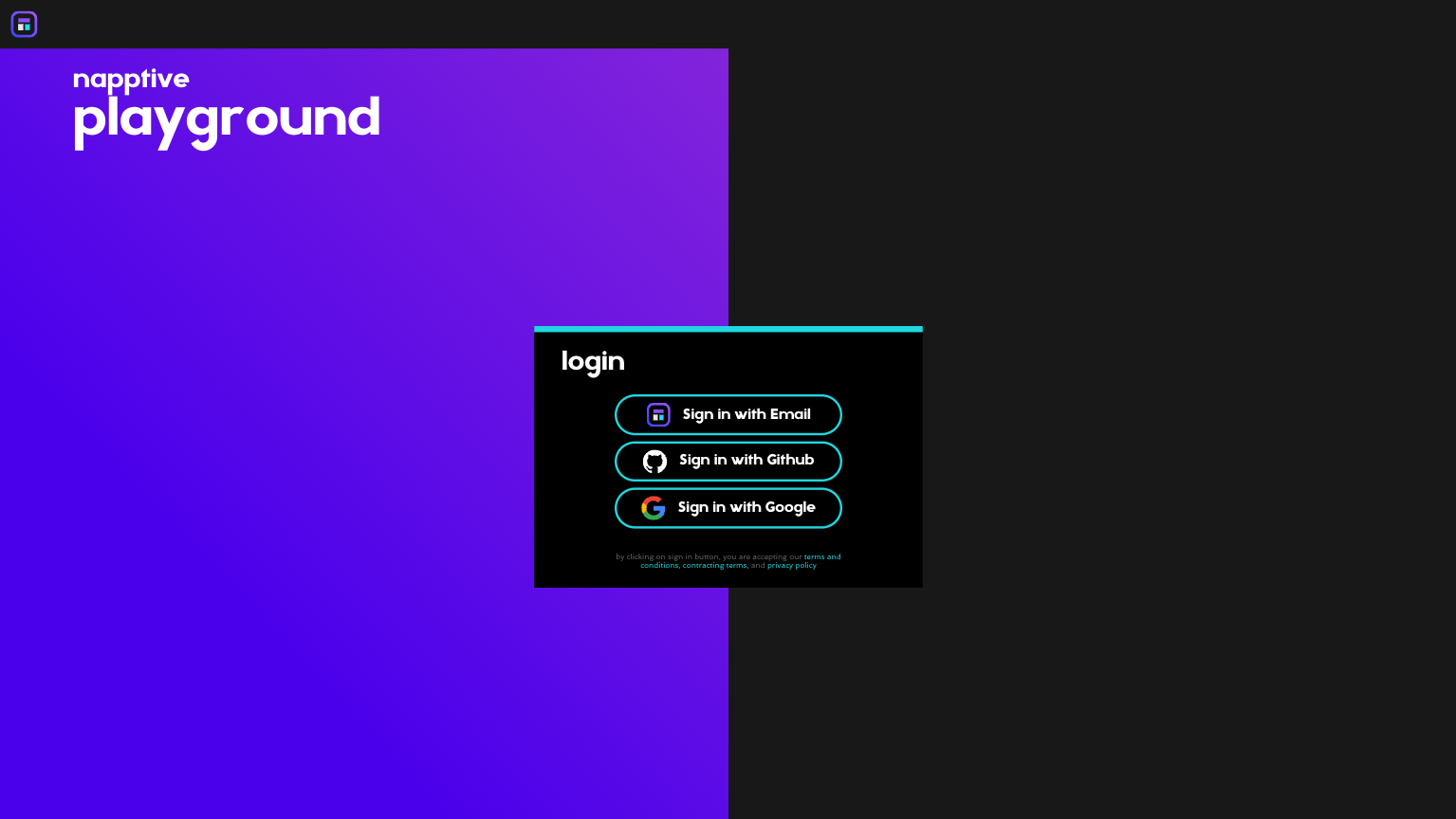
Login screen
Whats new board
As soon as you get in, a board with the news and latest changes is shown. It will always show up unless the “Do not show this message again” checkbox is checked.
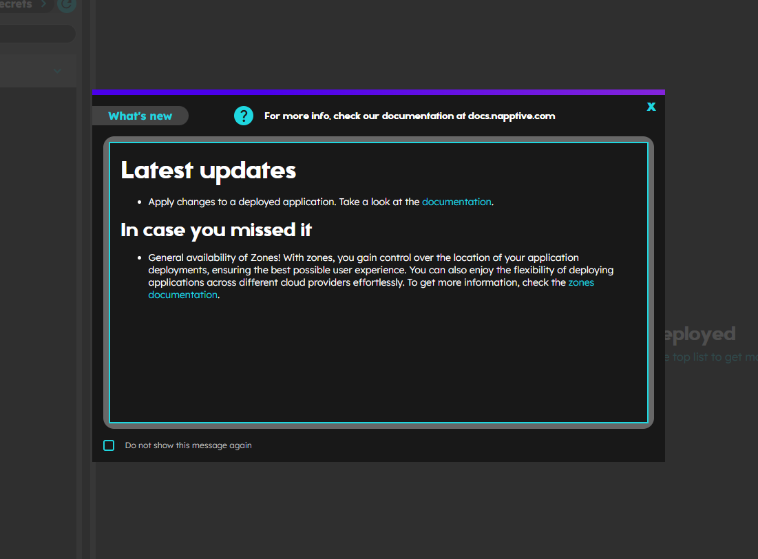
What’s new board
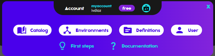
First steps tutorial
To ease the understanding of the Playground usage, a new tutorial board with few initial steps to learn basic actions is shown. To complete the step click on the Next button. The completed steps will show a green check in the list. The steps are enabled once the previous are completed. The user can navigate through the steps by clicking on the element of the list or using the buttons on the bottom right corner of the window. This can be skipped at any moment by clicking on the Skip tutorial button on the bottom left part. This board can be accessed using the bulb button in the bottom part of sidebar. 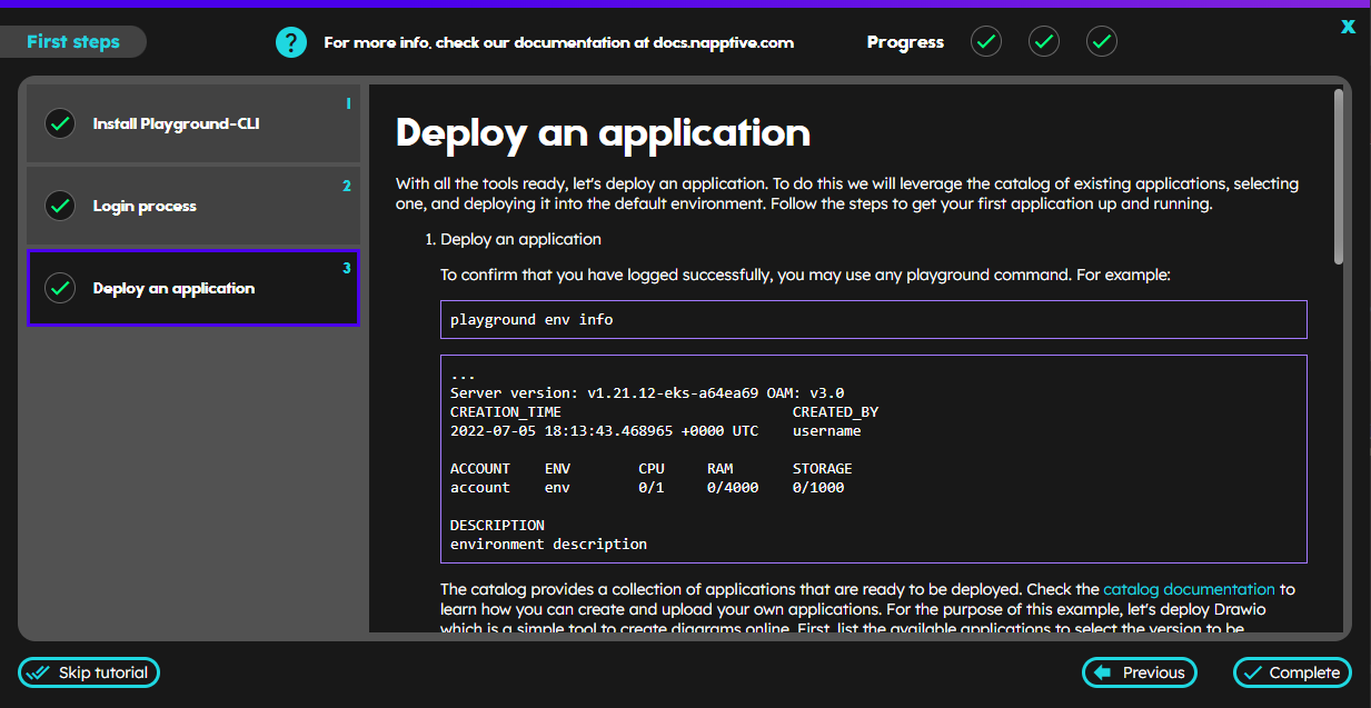
First steps tutorial board
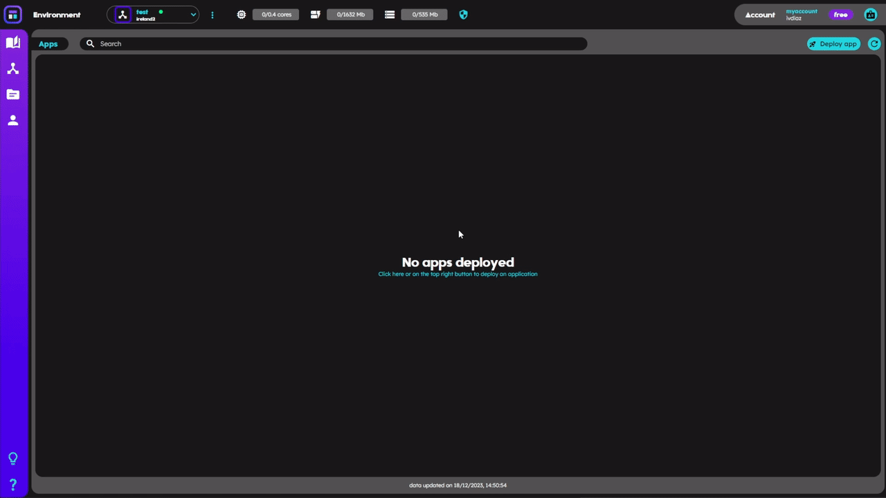
Dashboard overview
Napptive Playground Web is meant to provide a clear understanding of what is happening within the user environments, which includes everything related to the apps´ relevant information, the available definitions, and configurations. The web interface also enables the user to manage environments, as well as provides access to a catalog full of ready-to-deploy applications. The user will be able, also, to perform actions related to its account as it is detailed in the following articles of this documentation.
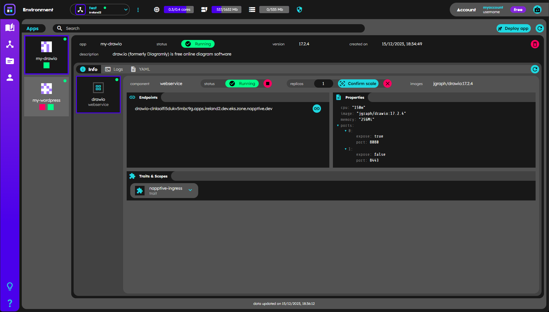
Main view of the dashboard with a DrawIO application running
Top bar
In the top part of the main view, in desktop mode, led by the Napptive logo and following the playground header, the user has the environment selector and also the environment metrics on the left side and the active account name, tier tag and the account button on the right. In device mode, the account is displayed when opening the navbar using the top right button
Account information on the top bar
Sidebar
On the left hand side, there is a sidebar with the Napptive color scheme gradient, where the user finds the Catalog button  at the top, which opens the catalog view, then, the user may open the environments management
  , following you can find the Kubernetes/definitions access
and finally, the User access button  to open the user section,
and at the bottom, the First steps tutorial button  that opens the tutorial , and the Help button
  on the bottom, that opens this documentation.
In device mode, the sidebar is hidden and may be displayed as a navbar when pressing the top right burger button.
Information
The main information that enables the user to know what is happening in its environment, is distributed in the following 2 sections:
- Environment displays the active environment resources information about the usage and total quotas (top bar)
- Apps provides all the information related to deployed applications and its workflows, components and policies
Data refresh
The Playground Web integrates an automatic data pull system that triggers after specific events like login, active account change, active environment change, application deployment, app delete or environment delete among others.
The user is always enabled to manually trigger the data refresh using the button on the top right corner of each card (or under the environment … menu). A formatted timestamp appears on the bottom of Kubernetes/definitions and apps cards that shows the last time the data was updated.
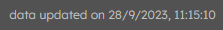
Also, the system incorporates another timer-data-update, triggered every 60 seconds, except during the app deployment from the catalog process, that starts an special refreshing data event every 5s until the app gets deployed or during the first two minutes.
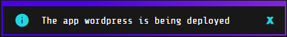
Data refresh while deploying
Toast notifications
Every time that a relevant event for the user happens, the web interface pops a toast notification on the top center of the screen, showing meaningful feedback for the user. The notifications are automatically discarded after 10 seconds by default, but the user is always enabled to close it at any time using the X button.
There are two types of notifications that the system will display depending on the event that happened:
-
Regular notifications: containing regular information related to what is happening, shown with a gradient blue to purple background
-
Error notifications: showing the error information featured by red background